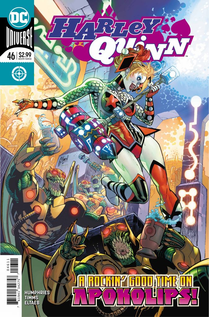
“Harley Quinn vs. Apokolips,” Part 2
 Writer – Sam Humphries
Artist – John Timms
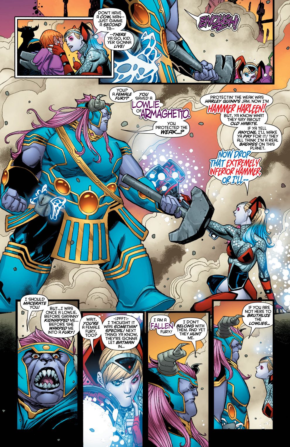
Harley Quinn #46 was a busy issue. The dialogue left little breathing room. This title feels like it has more words-per-panel than most. Big, bold splash pages filled the issue with little white space. The action was intense and ongoing. Excellent placement and variety of panels communicated the randomness of the story and non-stop pacing of the issue, but the lack of breathability and pause were suffocating, and yet, that’s Harley’s character.
The narrative of this issue was outlandish, yet, in the world of Harley Quinn, it worked! There were enough elements present that connected readers of Harley with the quirks of the character while removing her completely from familiar settings. For example, the newly acquired space hammer provided familiarity, yet lent itself to several humorous moments.
Harley broke the proverbial “fourth wall” multiple times in this issue. Writer Sam Humphries provided well-timed and genuinely funny lines throughout. The issue definitely earned its Teen+ rating. Still, Harley displayed layers. She is a character who genuinely teeters between heroine/villainess – as she does between sanity/insanity. The combination makes Harley one of the more compelling characters in the DC Universe. Humphries handled her well here.
With its frantic pace, it would be easy to miss the finesse of the artwork. However, the lines were clean and there was a certain softness to Harley. She was certainly fierce, yet conveyed with a subtle softness and ease of movement readers have come to expect of the nimble Ms. Quinn. The colors were brilliant and bled to nearly every edge of each page. Like previous issues, Harley Quinn #46 boasts a bevy of fonts, font colors, and speech bubbles that enable readers to keep up with its voluminous vocabulary. The work of Timms, Eltaeb, and Sharpe shined throughout the whole issue. Well done!
Conclusion
Harley Quinn #46 was a wild, non-stop ride. Admittedly, I prefer more grounded tales and this story was anything but. Still, the setting didn’t stop Humphries and company from adding layers of depth to its titular character. Artistically, the issue was filled with splash pages and action. Yet, it still conveyed a delicate beauty. For my taste, the issue suffered from a lack of breathability. However, it was enjoyable and moved the narrative to an interesting place. I’m intrigued to see where this one goes next!

Images courtesy of DC Entertainment


