“Batman: Curse Of The White Knight” – Book Two
 Writer and Artist: Sean Murphy
Color Artist: Matt Hollingsworth
Letterer: AndWorld Design
Review by Steve J. Ray
Batman: Curse Of The White Knight #2 is bonafide gold. We learn the history of how the Wayne family came to Gotham City, of their feud with the Arkhams, and their links to the Order of St. Dumas. We get threats, explosions, and long guarded secrets are stripped away for the world to see.
Losing ties to canon and the freedom to rewrite history makes this series one of the freshest and most invigorating on the shelves. As an old cynic this makes me happy, as it proves that there are still ways of telling an all-new Batman story.
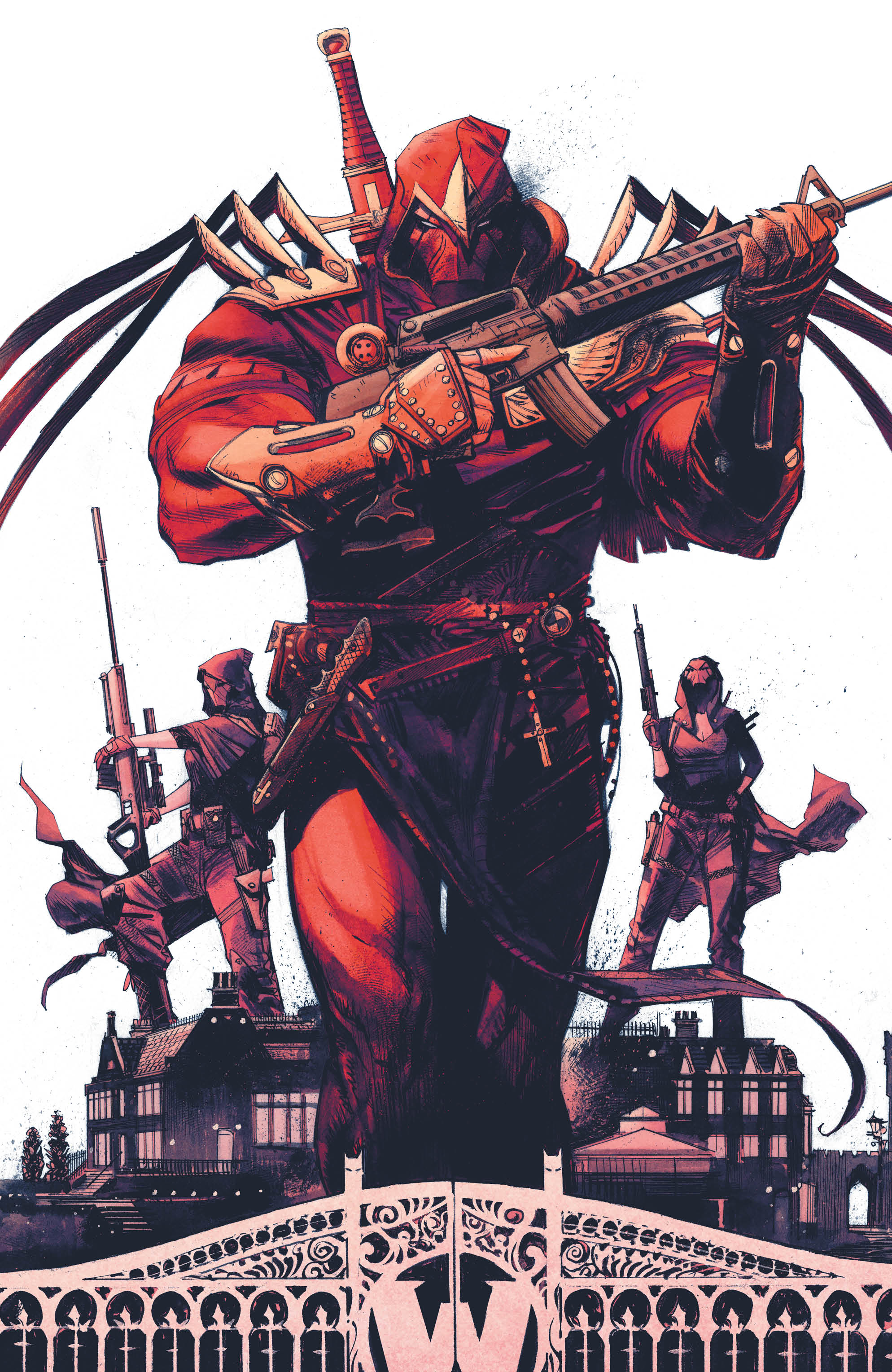
Sean G. Murphy is clever, creative and talented, of this there is no doubt. More importantly, however, he clearly loves these characters and is enjoying himself on this title. The character designs, the dynamism and joy leap off the pages. Laffy Arkham is a proto-Joker with bite, Edmond Wayne is the ultimate Batman/Zorro hybrid, and all of this feels completely familiar… whilst being something utterly brand new at the same time. Oh, and Harley Quinn… whoah, mama!
Batman: White Knight was impressive, but that story was clearly the fuel for this particular fire. The first series was the suburbs, this is the big city. (Thanks, Alan).
I am Vengeance
Comics are a visual medium, and Mr. Murphy isn’t just writing a kick-ass story, the guy can draw! His vehicles feel like they would actually drive and fly in the real world, his take on Batman is far enough removed from the original to feel different, but is clearly a classic Caped Crusader. His takes on Azrael and the Order are real eye candy, and every time I see a maniacal Joker in a Batman t-shirt, my heart just sings. The only downfall with this series is the four week wait between issues.
Matt Hollingsworth on colors and AndWorld on letters are the perfect partners for Sean Murphy. This series wouldn’t work as well as it does if it was lit in ILM-esque neon color. Not that there’s anything wrong with that style, but this book is the epitome of “Less is more.” Matt Hollingsworth doesn’t use a thousand colors when three will do. His palette is delicate, yet textured and layered. His flaming yellows, oranges and reds with the Order and Azrael, contrast with the cool blues and grays of his Batman and GCPD pages. It’s gorgeous stuff.
AndWorld Design lovingly place Sean Murphy’s words in the characters mouths, without obliterating the art. They’re integral to the look and feel of this title.
Conclusion
When you pick up a comic that reads as fresh and looks as great as Batman: Curse Of The White Knight #2, you cannot help but be impressed. It’s a solid story, with truckloads of character, constant surprises and high-octane action. There are very few things in life that are faultless, but this series comes darned close. Highly recommended.
Images Courtesy Of DC Entertainment


